ShopDreamUp AI ArtDreamUp
Deviation Actions


Suggested Deviants


Suggested Collections


You Might Like…


Comments42
Join the community to add your comment. Already a deviant? Log In
In all honesty you should probably take some tutorials and practice a LOT before you do any serious commissions. Take some free requests or art trades or something instead; I would not pay any money to have something done in the style of the pictures I have seen.
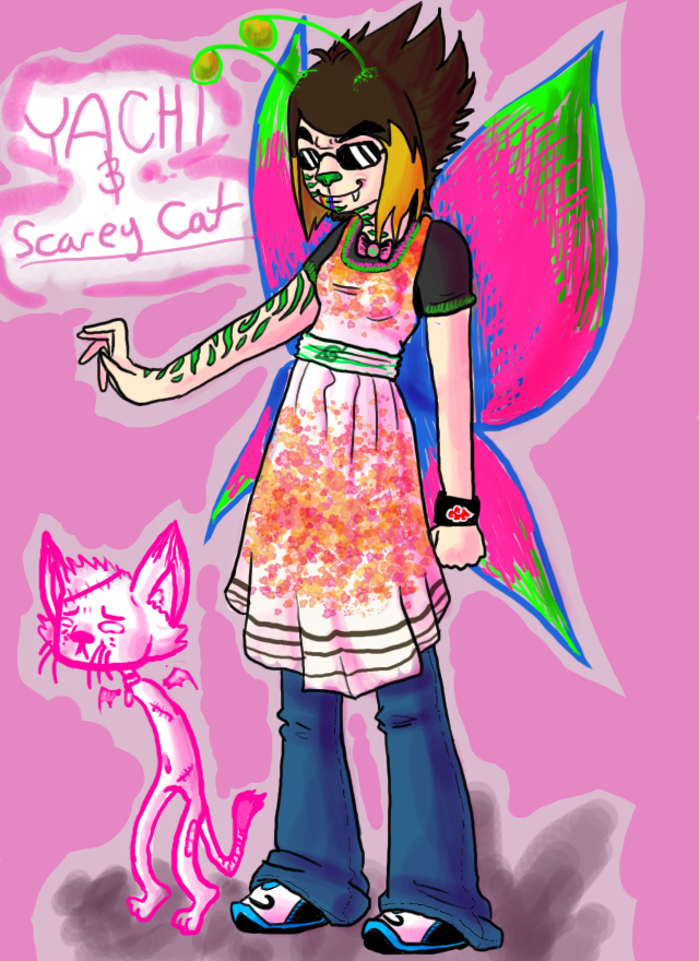
The colours are very pretty, and I totally dig the mix of green and pink, but you really need to make the wings look thinner and like they actually belong on the character. The shading is too messy and makes them look heavier than they should; plus, you have abused the burn tool and it shows. The burn tool is not a very good tool for shading, and the dodge tool isn't very good for highlights.
I see you have used the burn tool to shade the midtones and possibly the highlights, but the shading doesn't look very clear. In some places I can hardly see it. The folds of her dress and pants look okay, but you've added too many photoshop brush polkadots/flowers/whatever and it makes it look crowded. In cases like this, less is more.
The legs look okay but the right leg and shoe should be smaller since they are farther away - it's called foreshortening. Her right arm seems a bit too long as well and way too stiff, while at the same time a little lumpy.
And the fingers - the way they are positioned looks extremely painful; unless she is double-jointed, a pose like that would break her fingers. You have to consider the tendons, muscles and phalanges, as well as the metacarpals and carpals; bending the fingers back that much could pop the proximal phalanges(the first joints of the fingers) out of the metacarpal joints, and possibly seriously injure or even tear quite a few of the tendons and ligaments. These things hold the hands together; hands are not made like tinker toys or robot hands.
The hands themselves need to be made bigger, and the left hand should look bigger than the right in this position because it's closer to the viewer. Hands can be difficult to draw, but you need to remember how many fingers and how many metacarpals there are - you have made more than four bumps, making it look like she has many small fingers. That isn't good when you are trying to make some commission-worthy art.
The background looks extremely lazy here with the dodged outline and the burned shadow; it doesn't even really make sense because it doesn't mesh that well with the lighting. Remember where your light source is, so you can make a shadow that works. And use different dark colours instead of the burn tool because it will make your art look so much better.
Now the hair, I'm not much impressed with; the highlighting and shading is rather bland and gives the effect of a gradient rather than actual hair. You should try giving more of a distinct-looking shade and highlight, or look up some tutorials on how to draw cartoon hair properly.
The antennae look okay, and the day-glo effect looks kind of nice, but only just nice. It would look much better without the burn-tool abuse, and with more distinct shading and highlights. Right now the shading looks way too muddy, which is one of the reasons why the burn tool is such a poor tool for shading. The scratchboard effect with the pink on her wings looks very nice, but again it's ruined by the burn-tool abuse. They would have looked better with minimal or no shading.
Now for the kitty - I understand it looks heavily stylized and that might be your intention; however, it just looks way too bland as you drew it all in one basic colour, again using the dodge and burn tools from the looks of it. The kitty has potential for some nice personality, but it seems to just fade into the background. Maybe give him/her a darker outline and maybe some different colours for shading; it looks way too boring when done in just one basic colour in an otherwise very colourful picture.
Anyway, please do not take this as a personal attack - I am posting this to help you improve, especially since at the bottom it says you have requested a critique. I hope by 'critique' you do not mean 'ego stroking'. Might even do a redline/blackline critique to correct your picture, to show you how it could look.